Application Design
Preliminary Layout
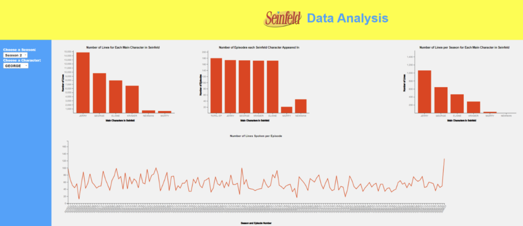
We decided to implement a similar layout to common applications for viewer familiarity and to reduce the learning curve for understanding its usage. Therefore, we made a sidebar to separate the filters from the data. We made a title bar to relay the reason for the application, and a footer to note its authors.
Bar Graphs
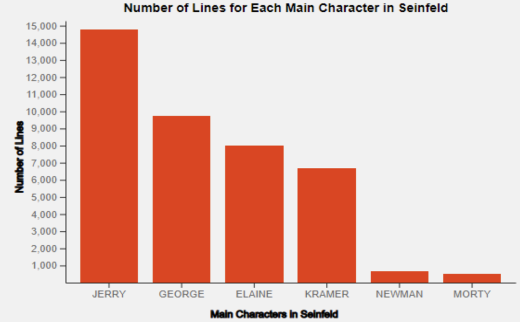
Bar graphs were intended to allow users of our interface to compare character statistics with one another. They are easy to implement but provide a great deal of overall value to a visualization interface.
Word Clouds
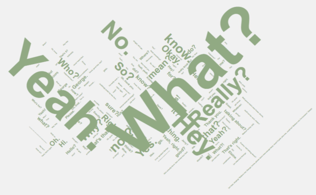
Word clouds were included to provide the user with a glimpse into the personality and uniqueness of each character. However, to achieve this, it was necessary to filter out stop words and clean our dataset. In theory, the word cloud would contain common sayings and phrases unique to each character.
Finalized Layout
The final layout was only slightly modified to that of the preliminary layout. First, we colorized the headers and footer – further discussed below. Second, we allowed for some visualizations to cross into two columns. This allowed for the viewer to effectively assess the visualization without scrolling, brushing, or zooming in. Lastly, we added the logo in the header.
Finalized Visualizations
Bar Graphs
Bar graphs were used to allow users of our interface to compare character statistics with one another. Bar graphs were the best way to represent statistics such as episode count and line count. By mapping these on bar graphs, users can gain a visual sense of how many more specific characters were involved in the show than others. These bar graphs also included tooltips that display the exact values of data points.
Line Chart
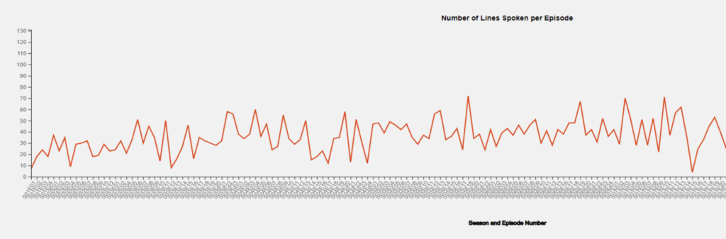
Despite being absent from our preliminary design, our team decided to implement a line chart in our visualization. This line chart is specific to each character and represents how many lines the character speaks per episode. This chart provides a good indication of how involved a specific character might be in a particular season or episode.
Word Clouds
Word clouds were used to relay personality and vocal trends within a specific character. By analyzing every line by a character, the word cloud displayed the most common sayings and phrases for each character throughout the duration of the show. By comparing the word clouds of different characters, it is evident that some of them have vastly different personalities than others.
Font & Size
The font that we used was intended to be recognized by the viewer as nominal. This method allows the visitor to digest the text information without difficulty or delay in its comprehension. The font was universal throughout the application.
Furthermore, the logo in the title was not only used because it looks good, but because the logo is recognizable to the viewer. The logo was followed by text that further gave reason to the application. This text was large to match a similar size of the logo, and also make it a title header for the user.
The general text was kept to a readable size and varied by 2px depending on the header. For example, the axis header vs tooltip. The footer text was also within this range as there was no need to highlight it further as it was already separated by color and padding.
Color
The color was strategically chosen to match the Seinfeld theme. The brighter yellow background in the title bar and the footer are from a later Seinfeld logo, and the logo used in the header is the first Seinfeld logo. Therefore, the yellows do not clash.
The color was extracted by Adobe’s Photoshop software using a tool dubbed Eyedropper. We can set the hexadecimal rounding of color from the desired radius. Or we can extract the exact pixel upon click. The latter was used for all colors. Namely, the yellow used is #fcff00, the blue used is #38a2ff, and the red used is #eb3500.
- Yellow was chosen as the title background color to not distract from the visualizations. Yellow appears lighter, so the background of the visualizations could keep light.
- Blue was chosen for the sidebar as it has a higher contrast to the lighter background of the visualizations and continues the Seinfeld theme.
- Red was chosen for the accented data in the visualizations such as bars and lines. Red is a color known to draw immediate attention of the human eye, so it is fitting to immediately highlight the data output.
- Black, being the highest in contrast to the visualization background, was selected for the small and labeling elements of the visualizations. This was imperative to make it easy for the viewer to see the small print of the visualizations. It also doesn’t draw attention away from the data in red.
- Grey was subtly used behind the visualizations over white. The decision to do so was to make it less bright for the viewer as white can sometimes be overpowering on some computer screens, especially when there is a lot of it.
- White was left as the official background to the overlaid containers. If you zoom out extremely far (unreasonable), the borders will reveal the white. This could be seen on extremely large and wide sized screens. It provides the viewer with a small contrast to the application and border.
Element Border & Thickness
The thickness we used was solely based on the data’s readability. This means if the text or visualization elements were difficult to read because it was not prominent enough, the border and/or thickness was increased. On the contrary, if it was too prominent or too large to understand, then it was decreased. There was a happy medium.
Margin & Padding
We chose to separate the title by 100x in both directions. Not more as it would fill too much of the screen, and not less as it would’ve provided the viewer with compactness. To understand the data, we felt it was important to keep it uncongested.
The sidebar was specifically padded, not just with color, to permit familiar usability of an application. We see in most applications that there is a menu of sorts that can control the visible data; such as, filters, order, etc. Therefore, providing the viewer with familiarity reduced the learning curve to adoption and usage.
The visualizations were separated with slight padding, but some offered their own by default. Specifically, the world cloud has its own padding that seemed almost unreasonable. We suspect this is due to all the other words that weren’t visually there, so D3 thought it still needed space to display those. We could simply reduce the number of words being displayed to regain reasonable margins; however, since the data changes per character, this wasn’t a good solution.
Lastly, the footer is a bit smaller than the header, both in text and height. This was because of the amount of information that needed display. Additionally, having it somewhat match the header provided the viewer with a “full circle” and familiar experience to their nominal web app usage.
Layout Responsiveness
When on a smaller sized screen, the layout will condense to a single column and shorten the sidebar width, without compromising the visualizations. Depending on how small, the visualizations will not scale down as it would be too small for the viewer. However, the user is able to scroll through L/R for the visualization.
On a regular desktop sized screen, the visualization layout will have 2 columns for elements. The larger visualization (line chart) will be over 2 columns. The sidebar will also grow slightly if space allows.
Implementation
Project Setup
Our work is hosted on a local web application, built on HTML, CSS, and JavaScript. Visualizations were completed using the D3 library, and data manipulation was accomplished through python and excel. To launch the web application, the user can use a simple python server running on LocalHost:XXXX.
Directory Structure
The project folder was then expanded by the addition of:
- index.html
- scripts.csv (dataset)
- scripts_cleaned.csv (dataset)
- Js directory containing various .js files which contain the source code for our visualizations and interactions
External Packages Used
The team used the D3 starter template provided by Dr Aurisano, containing the D3 library.
We also used select2 for our dropdowns, which came in handy throughout the design process.
Challenges
One challenge we faced dealt with the line chart and being able to properly provide tooltips and brushing interactions. Considering the x-axis was strings, we had a very hard time providing the tooltip and the brush with numerical values. We even tried to give each of these string values a numerical value to them, and it still did not work properly. A scroll bar was also attempted to be implemented so that the x axis ticks were not so bunched up, but we were unable to figure out how to do that either. Having string values as one of the parameters made it extremely difficult to do anything other than create the chart. Even getting the chart to populate was extremely difficult, considering we never ran into having to use strings as a parameter.
Another challenge that we ran into was getting the wordclouds to disappear after creating them dynamically. When clicking on a character, a line chart and a wordcloud were dynamically created, and when another character was selected, the line chart was replaced, but the wordcloud was not. A new one was created for the selected character, but the previous wordcloud was not replaced, so it continued to stay on the screen. We could not figure out exactly why this happened, since the implementation of dynamically creating these visualizations were all the same.
Development Process
Code Development
All work was completed in VS Code, via Live Share so all engineers could work in parallel; at major stopping points all work was backed-up via Git/GitHub.
Another plus is the averaging and captures that can stack (as shown below). This allows users to adjust frequency based on modified captures for the best sound.
Structuring the Code
The code was structured in a way that we had a .js file for each of the global charts (the charts that represented all the characters) and then a single .js file for each of the dropdown capabilities. Each time a character was clicked on, character_index.js, characterData.js, and lines_per_episode.js were all used and designed in a way to dynamically create these charts, so that there didn’t need to be six lines_per_episode.js files to cater to each of the characters’’ data. This made the code base less cluttered and the code itself more efficient. We designed it in a way so that if you did want to add more characters or seasons, it would be very easy to do so. The wordcloud implementation was included in the character files and was created along with the line chart. The same implementation was applied to the season dropdown, where we had a “season_index.js” file, seasonData.js file, and a easonBarchart.js file and these bar charts were also dynamically created once an option was selected