The goal of this project was to create an interactive visualization application to help a general audience explore the thousands exoplanets discovered by the Kepler Space Telescope.

My Motivation
My motivation for this project was to better understand JavaScript as it’s something I’ve always wanted to understand. Synonymously is the visualization and interactions it relays. I find it important how humans communicate with data, as it could also have an influence on their perception and understanding of the data. The goal is that they can form majority of their conclusions from all types of data from the single tool at hand. However, with this project, we focused on exoplanets and all the data it entails.
Once I had a good understanding of the dataset, and before I went to sketching, I explored the tools at my disposal. The tools were made possible (via code and description) through class; however, I also searched online for several visualizations and similar tools. One specifically had exoplanet interaction that was out of my league, but also gave me a sense of motivation; so much so that I dove into a JavaScript framework called React. However, I was told this is out of the scope of this class.
The Data
pl_name
Planet Name
hostname
Host Name
sys_name
sy_snum
Number of Stars
sy_pnum
Number of
Planets
Discovery Method
pl_orbper
Orbital Period [days]
pl_orbsmax
Orbit Semi-Major Axis [au])
pl_rade
Planet Radius [Earth Radius]
pl_bmasse
Planet Mass or Mass*sin(i)
pl_orbeccen
Eccentricity
st_spectype
Spectral Type
st_rad
Stellar Radius [Solar Radius]
st_mass
Stellar Mass [Solar mass]
sy_dist
Distance [pc]
To design this data visualization tool, I know that needed to understand the dataset we were using. Therefore, I explored several Wikipedia articles, which led me down several rabbit holes. I learned about the different systems, distance metrics, and more.
Provided, like the above, was the name of the column with the title. I used this to learn about the scales that were most likely going to be used, and the data separation to see if logarithmic or linear scaling was needed.
Sketching
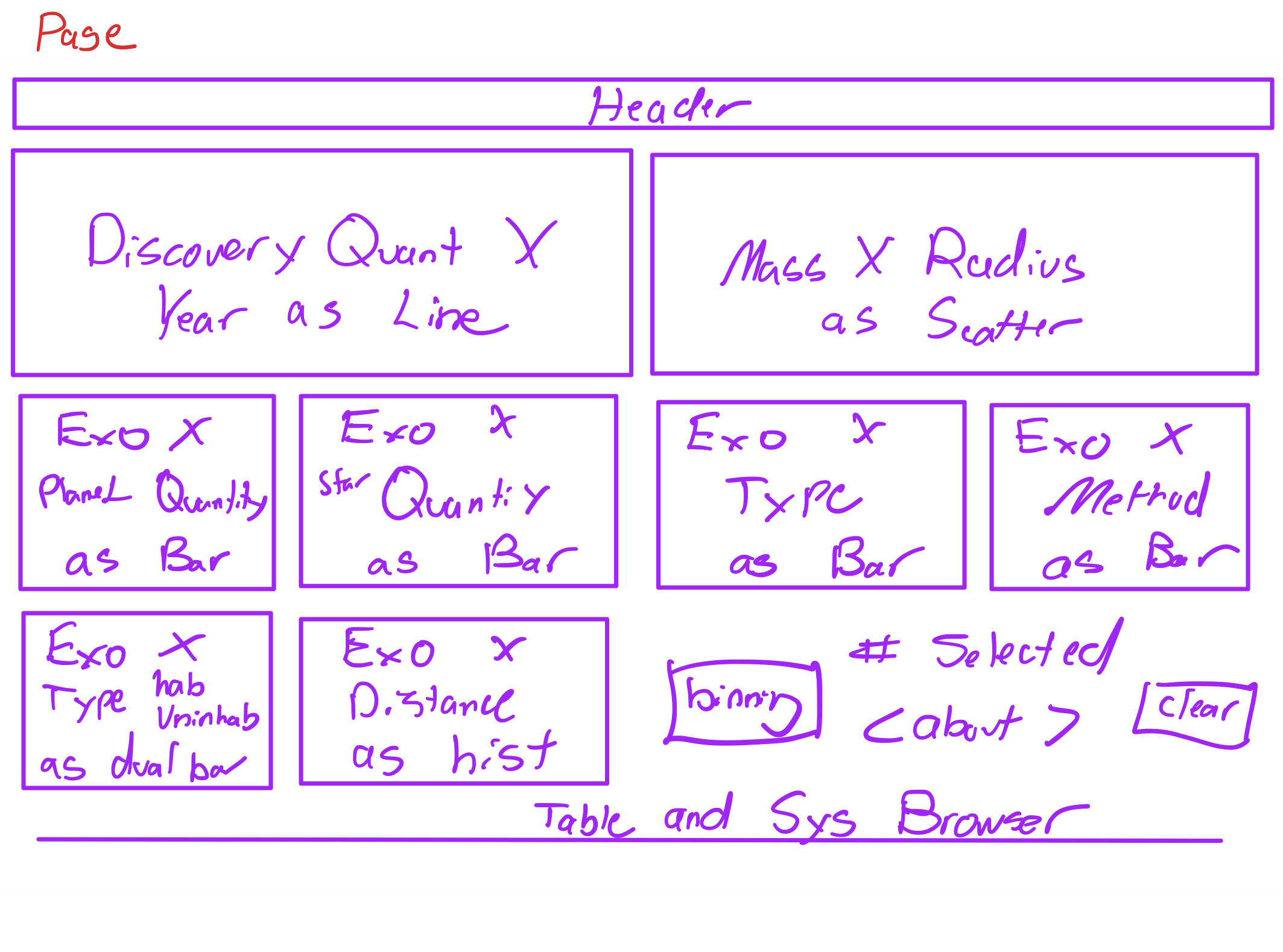
Slide the blue bar above to see the sketch to the final data exploration tool.
The main sketch I made as at high level, so I had room to explore each visualization individually.
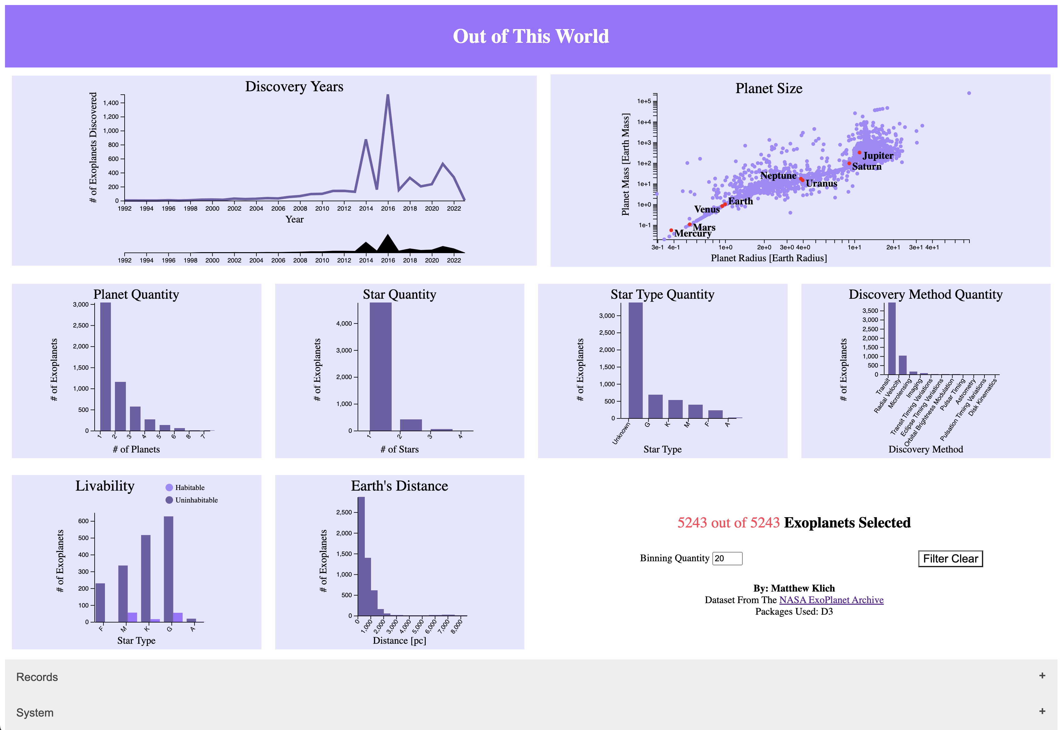
Header
I wanted to keep the header bar as simple as possible, so gave it a filled color (the purple) and used an inverted color for the text (white). I felt it was important to declare what the tool’s name was, which as a byproduct gives the user a sense of what the tool is used for without having to read a description.
In the HTML header, it is labeled Project 1 – Out Of This World, which provides an additional layer of solidification for this class.
Color / Theme
I chose purple, not just because purple is my favorite color, but because it is a good contrast to the white on the page and is not black. A high contrast visualization isn’t as inviting as a colored visualization. I didn’t want to rainbow color because it could obstruct the user’s interaction with the visualizations. I used different scales of purple to separate elements on the page e.g. borders, boxes, highlights.
Another color I used was black for the text, axes, and graphs to give them that max contrast. It was important for the user to be drawn into these elements first.
Finally, the last color I use was red as an accent color. Mainly, it was used as a selection tool, highlighting the elements that were selected. More on this later.
Layout
The layout was very important. As an operationalist, it’s important to have a flow and interact (more on interact later). Therefore, instead of making a nontraditional layout, I kept with an organized table without the border (in the HTML). At the top I put the elements that could funnel down the data in a range e.g. the years selection. I wanted to them maximize my space without it looking too confusing, so put the scatterplot to the right. Thereafter, I put all the bar charts, followed by the habitability an histogram of the distances.
Additionally, I made the light purple boxes change color to indicate to the user where their cursor lies. This also gave another layer of interaction within the layout.
Visualization Components
Here we navigate through each visualization and how they interact with the data for user exploration.
Linechart
Data & GUI
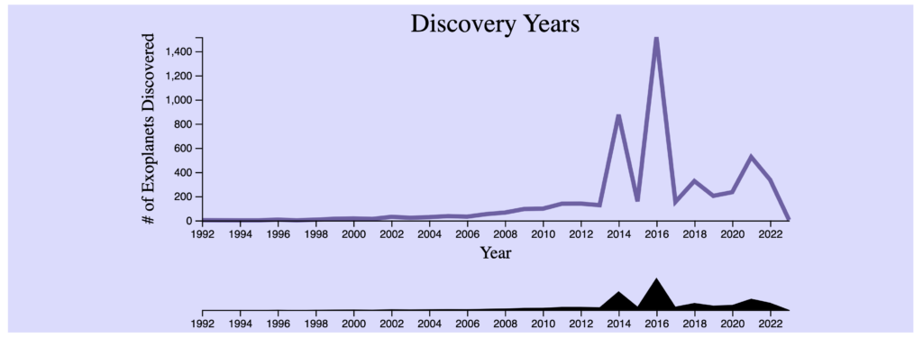
The data we used was the Discover Year by the count of the number of exoplanets discovered. This allows the user to visually identify what years had the most or fewest findings. The element’s default range is the earliest data discovery year to the latest and any selection can be cleared with the clear filter button.
The color of purple was used to draw the line in conjunction with the theme, and the color of black for the tooltips was continued to be used for the text. This allowed the text to be seen clearly over the purple line. In my experience, having the range selector purple took away from the above, so hid it with black.
Interaction & Updates
This data is pulled by an interactive line chart so the user can:
- Click, drag, and let go of a slider to select the year range to zoom into. This allowed the user to zoom into a, perhaps, flat area, and identify any variation not seen in the full range view.
- Hover over the line chart to see a tooltip of the count at each year.
After a year selection, the rest of visualizations are updated to only that year range.
Scatterplot
Data & GUI
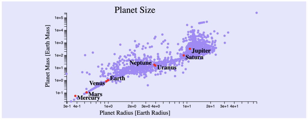
The data we used was the Planet Radius by the Planet Mass. This allows the user to visually identify clusters and outliers. The element’s default range is the full scope of data, and can be cleared with the clear filter button.
The color of purple was used to represent the planets, and the color of black for the tooltips and earth’s planets was continued to be used. This allowed the text to be seen clearly over the purple circles. The red circles for earth’s planets is easily seen and also continues with the theme.
A possible improvement to this would be to see a color representation of the types to identify any patterns.
Interaction & Updates
This data is pulled by an interactive scatterplot so the user can:
- Hover on a planet and view the Name, Radius, and Mass.
- Click on a planet to view the record.
- Click, drag, and let go of a box to select a group of data.
After a group selection, the rest of visualizations are updated to only that group of planets.
Barcharts
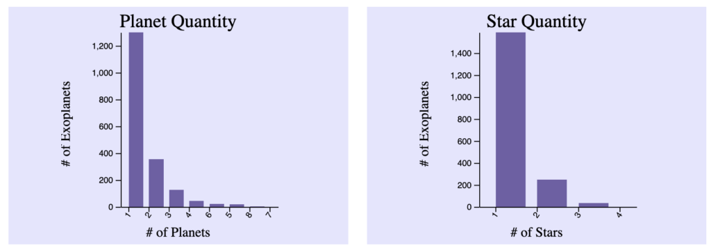
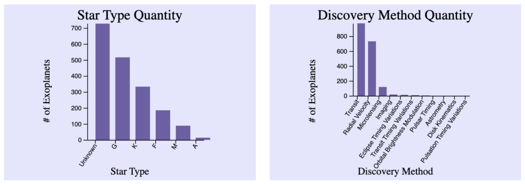
Data & GUI
The data we used was the number of exoplanets by the number of planets, number of stars, star type, and the discovery method quantity. The element’s default range is the full scope of data, and can be cleared with the clear filter button.
The color of purple was used to represent the data, and the color of black for the tooltips was continued to be used.
Interaction & Updates
This data is pulled by an interactive bar chart and reused for each visualization. In the interactive bar chart, the user can:
- Hover on the bar and a red indicator appears letting the user know this is selectable.
- Click on a bar to enact that filter.
- Click on a X label name to add to that filter.
- Hover on the bar and a tooltip appears.
The rest of the visualizations are updated after that filter is applied, or deselected.
Dual Barchart
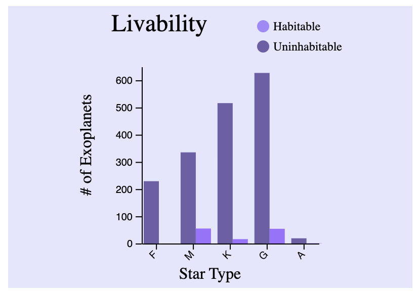
Data & GUI
The data used was the number of exoplanets by the star type and its habitability. The element’s default range is the full scope of data and can be cleared with the clear filter button.
The color of purple was used to represent the data, and the color of black for the tooltips was continued to be used. The tooltip shows the number of exoplanets and the star type in the bar.
Interaction & Updates
This data is pulled by an interactive dual bar chart. In the interactive dual bar chart, the user can:
- Hover on the bar and a tooltip appears.
- Hover on the key and a red outline appears letting the user know it’s clickable.
- Click on the key to enact that filter, and it changes to have a red outline. Selection both enacts both filters as it does by default.
The rest of the visualizations are updated after that filter is applied, or deselected.
Histogram
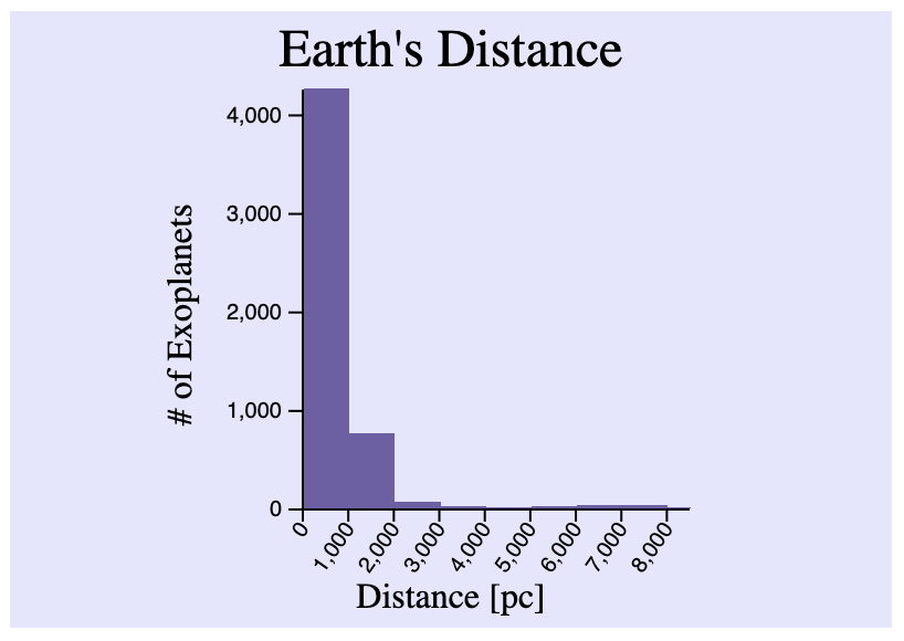
Data & GUI
The data used was the number of exoplanets by their binned distance. The element’s default range is the full scope of data and can be cleared with the clear filter button. The default number of bins was set to 20.
The color of purple was used to represent the data, and the color of black for the tooltips was continued to be used. The tooltip shows the number of exoplanets and the distance binning range.
Interaction & Updates
This data is pulled by an interactive histogram. In the interactive histogram, the user can:
- Hover on the bar and a tooltip appears.
- Change the binning quantity to see how the data changes within the selected data.
The rest of the visualizations are updated after that filter is applied, or deselected.
Table
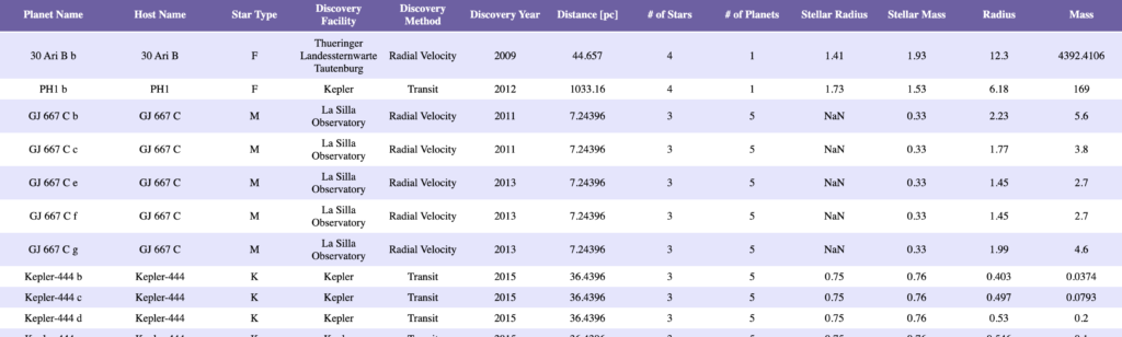
Data & GUI
The table uses all records of data. To enter the table view, you must select an accordian. This as implemented to not overwhelm the user, but allow them to deep dive into the records as necessary.
The color of purple was used to separate the rows, and the color of black for the text was continued to be used.
Interaction & Updates
This data is pulled by an interactive table. In the interactive table, the user can:
- Hover on the record and select it. A red outline appears across the row.
- After a record is selected, the bubble plot will output.
The rest of the visualizations are updated after that filter is applied, or deselected.
Bubble Plot
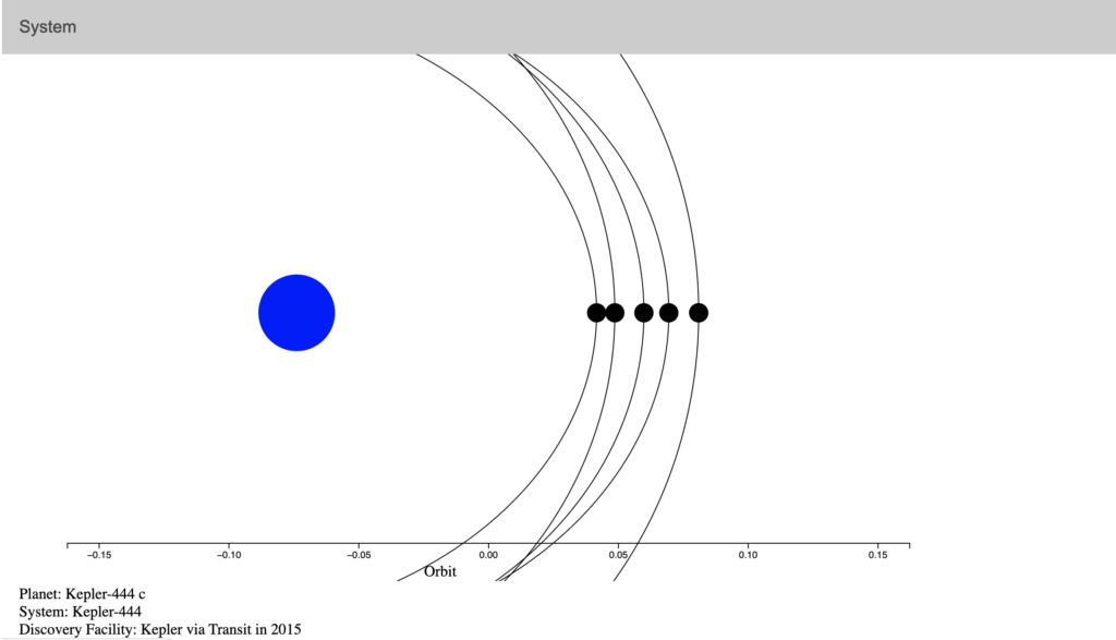
Data & GUI
The data used was the hostname, planet name, stellar radius, stellar mass, planet mass, planet semi-major axis, and spectral type. The element’s default graph is hidden because it’s nothing. Only when a record is selected by the scatterplot or the table will a system be displayed.
The color of the record depending on the type is shown. A textbox below shows the rest of the data about the selection.
Interaction & Updates
This data is pulled by a bubble plot. In the interactive bubble plot, the user can hover on the planet and a tooltip appears showing the hostname, type, orbit, and radius. The user will get an experience for the record, visually seeing the distances of the objects.
Discoveries
A few discoveries that I made are below. On a personal note, I never really studied space.
- Transit is the best discovery method. I’ve never heard of that.
- I could’ve guessed this, but I didn’t know for sure – most exoplanets are uninhabitable.
- Most exoplanet discoveries were made in the last 10 years.
- Most planets are more mass and are greater in radius than earth.
- Most stars do not have a star type.
Process
Libraries and Code Used
The libraries I used were D3 for the elements. The languages used are HTML, CSS, and JavaScript.
Code Structure
I first started with a React app, so I kept a similar code structure as that. It was important to separate the graphs/charts into their respected files. I used those as components/elements called from main.js. This was important because functions declared within (unless global) would not affect other components. I dubbed this directory graphs/.
Since I added an actual components/ called accordion, I separated it with a components/ directory in case others were going to be added.
As it should be, all CSS style sheets were separated by a styles/ directory incase other style sheets were going to be added. I only kept the one.
Index.html and main.js were kept in the main directory as they are the core of the interface.
Data also had its own directory dubbed data/ since I used 2 ways of pulling data for the interface
Access & Run
To access the data, click the GitHub link below.
For the most uptodate run information, see the most updated README.md. In this case, it might be in the dev branch.
Challenges
The greatest challenge I personally faced was learning JavaScript. I know several OO languages but this different. Additionally, learning the D3 library has a further hurdle. However, both were overcome with practice, online help, TA, and other resources.